7

My name is Sean and I'm the Art Director here at Stack Exchange. I've been awarded the Fitness and Nutrition identity and communications development.

I'm happy to meet everyone and look forward to launching the site and supporting this community. :)

enter image description here

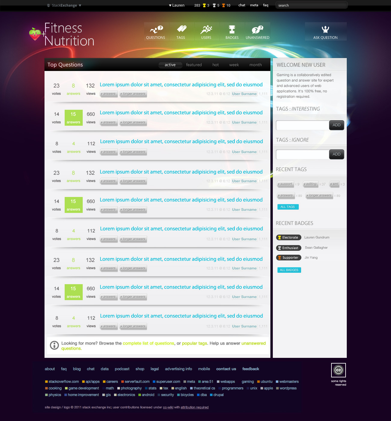
This design is meant to convey energy, and life force and power and at the same time be serene and nurturing. Hopefully embodying the combination of both Fitness and Nutrition.

enter image description here

enter image description here

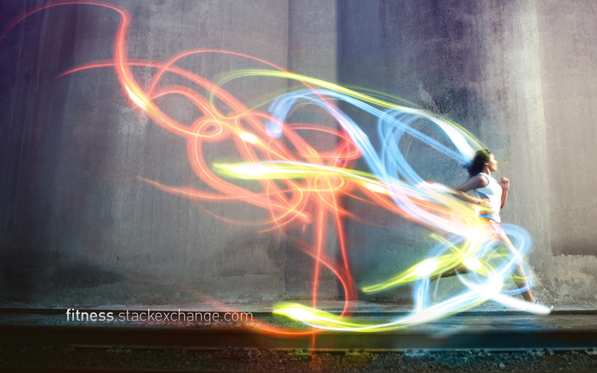
One of the earlier concepts that seemed strong, was showing how food and exercise are both energy. Wrapping a person exercising with light trails, or "energy trails" seemed to achieve a positive ambient image, that was colorful and rich, without being over the top.

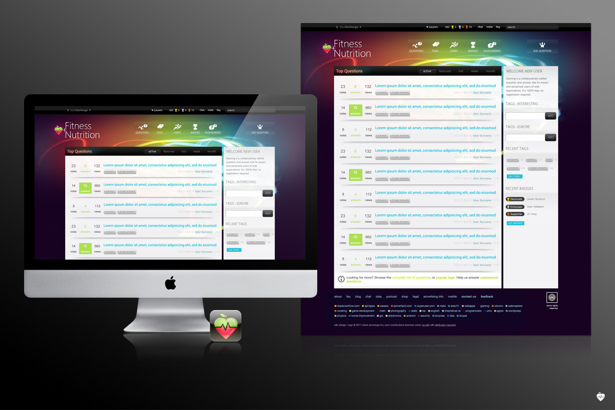
The brand is an apple combined with a heart. The heart rate monitor image divides the two objects, but also seems to join them. These icons are generally accepted images of nutrition and fitness. Plus they just seemed to make an interesting icon...

I hope you enjoy looking at this as much as I've enjoyed making them. I look forward to your thoughts and feedback.

Thank you.
14
  • I think this would be a great design for techno.stackexchange
    – user2499
    Commented Dec 9, 2011 at 1:14
  • 1
    I particularly like the last design; but that's more of a banner/page ad than anything. I would have liked to see the background of the main site not be so dark, it seems to loom heavy, unlike the last image. Lastly, the iconography for "Questions" and "Users" seem to convey motion, while "Ask a question" does not, which seems inconsistent (or maybe you're trying to convey "I've come to a halt/stop/situation where I lack knowledge, I need to ask a question").
    – casperOne
    Commented Dec 9, 2011 at 1:16
  • I hope that Runner image isn't copyrighted by [fill-in-large-running-shoe-brand] :P
    – Ivo Flipse Mod
    Commented Dec 9, 2011 at 9:48
  • nice work @Sean!
    – Lauren Staff
    Commented Dec 9, 2011 at 16:01
  • Thanks for the feedback. @nullUserException looking forward to your area51 on techno.
    – Sean Gallagher Staff
    Commented Dec 9, 2011 at 17:57
  • 1
    @casperOne I see black as an elegant color that provides a powerful backdrop for color to sing on. I'm modelling our site experience on David Barton / Crunch style : modern, not scared of richness in imagery + color, culturally diverse. Also, I don't actually hit black in color. It's a dark purple / deep blue / deep burgundy. Colors directly sampled from the banners and cards made from our 10k promo. Ask Question button noted. Great feedback.
    – Sean Gallagher Staff
    Commented Dec 9, 2011 at 17:57
  • @ivo flipse We own the runner image.
    – Sean Gallagher Staff
    Commented Dec 9, 2011 at 17:57
  • No worries @ Lauren THANKS!
    – Sean Gallagher Staff
    Commented Dec 9, 2011 at 17:57
  • Maybe it's a good time to revisit tagline ideas.
    – user241
    Commented Dec 9, 2011 at 19:37
  • 1
    Needs more fit folks in spandex, eating.
    – Shog9 Mod
    Commented Dec 9, 2011 at 20:40
  • Shall I pose @Shog9 Or should we ask Lauren instead ;-)
    – Ivo Flipse Mod
    Commented Dec 10, 2011 at 9:16
  • On second thought I feel that highlighting Nutrition in the title is a bad idea, because new users never, ever check our FAQ before posting a question and therefore not realize that their question has to relate to exercise.
    – Ivo Flipse Mod
    Commented Dec 10, 2011 at 22:47
  • The users will acclimate to the site over time. We also have all these lovely mods, our knowledgeable and friendly user community leaders, and of course super intelligent site AI, in addition to our FAQ, as that is the purpose of having all these things : helping users with their questions + answers, and learning the tone of the community. Nutrition is also NOT highlighted. It's presented secondarily to fitness in order. Fitness gets top-billing. It's simply in the same size typeface. Nutrition is a crucial part of fitness.
    – Sean Gallagher Staff
    Commented Dec 11, 2011 at 20:29
  • While I cannot speak for the whole community, I know that for me understanding nutrition, even when not directly related to exercise is key to my becoming and staying fit.
    – Sean Gallagher Staff
    Commented Dec 11, 2011 at 20:29

4 Answers 4

2

I like the buttons and background and all that jazz. Cool work, Sean.

I have to re-iterate my agreement that nutrition should be dropped from top billing before launch, but that won't happen, so moving on...

I like the apple/heart combination, but after someone said "strawberry" I can't un-see it. :(

The only criticism I see is shared with other SE sites, and that's that a user's point total and number of gold badges are too close together, and so get confused. I always see "283 gold badges, 3 silver badges, 5 bronze badges, and 10 _" instead of "Lauren has 283 points, 3 gold badges, 5 silver badges, and 10 bronze badges".

1
  • Thanks for the notice on site badges, I'm new to a lot of the mechanics and certainly of the mindset of allowing more space in general for things to breathe.
    – Sean Gallagher Staff
    Commented Dec 14, 2011 at 5:48
2

I love the look of the site, but I do think the strawberry/apple isn't really very indicative of what the site is about.

To me it instantly tells me to expect questions about an apples vitamin content, which vegetables go best in a smoothie, how many carrots should I eat in an hour.

The target audience of this site is more sport oriented and I think they would be put off from exploring the site further. Most of the questions on the site are either about running or weight lifting. I think the logo should really represent this.

Any questions about apples on this site would be closed pretty quickly.

1

I may not agree with Nutrition being in the title this prominently, given that its just a subset of the site. But I love the icon!

I also really like the images above Questions, Users, Badges and Ask a Question. They do a great job of showing that we're allround. Also the badge icons, we all love winning trophies :-)

I'm not really sure if the blue of the Question titles has the right contrast, but that might be more of a problem on a smaller image than when the site is full-scale. Also the text on the tags is perhaps a little hard to read.

But all in all I think the design looks great!

1
  • Thanks for the feedback. I also think trophies are fun! Everyone is a winner! The blue and greens may need to have more contrast. I'll try adjusting it... It would be more realistic to view the site design full size. I think you can open the images in a new window by clicking them? I know right clicking them allows a full size view. You may need to view it at 100% or zoom in depending on browser / settings.
    – Sean Gallagher Staff
    Commented Dec 9, 2011 at 17:47
1

The background is a little dark for my tastes, but I think it works with the bright, energy swirls. I see the concept you were going for in the design. I especially like that last image with the runner. She stands out really well against the environment. I remember seeing it in a banner from one of the events that @Lauren went to and thought it looked really bad-ass. It's evocative and makes me want to go do something.

The only thing that doesn't really jive with me is the icon. The heart+apple at first glance looks like a weird strawberry I don't want to eat. I think it is a clever design though with the combination of fitness and nutrition and the heart line going through it.

1
  • 2
    I see what you're saying about the strawberry. Making an icon for something like this is tricky. I may adjust the colors or make it one color... This overall direction is based on the event materials that we designed. I spent a lot of time w Lauren on that, as we wanted to capture a feeling that we could carry into the site design and branding. It's hard to show light without dark. and using a lighter / more greyed out color or the concrete texture was very busy against the site title and also the links and buttons. thanks for your feedback
    – Sean Gallagher Staff
    Commented Dec 9, 2011 at 17:44

You must log in to answer this question.

Not the answer you're looking for? Browse other questions tagged .